Merry Christmas!
Merry Christmas, to all of y'all who celebrate it! (And happy Wednesday to everyone who doesn't.) I'm on holidays, so I'll keep things brief down here. But come back on Friday for our next comic!
-Sam Logan
Merry Christmas!
Merry Christmas, to all of y'all who celebrate it! (And happy Wednesday to everyone who doesn't.) I'm on holidays, so I'll keep things brief down here. But come back on Friday for our next comic!
-Sam Logan
Thanks, hun
Ho ho ho! I'm taking the week off work, but worry not... our Christmas story will continue on the usual schedule. Come back on Wednesday for the next instalment. Rodalf demands it!
-Sam Logan
Sam and Fuzzy Q & A: Gutter Edition
Got a question you want answered? Just drop me an email with "Q & A" in the subject line!
"How Dev name is pronounced? To be fair, I have some trouble figuring out how to pronounce it. Also, what inspire you to create such a lovely character? Is there a story behind her creation?
Regards from Mexico City." -Edwin
Devahi's full name is pronounced DEV-AH-HEE: DEV (as in "developer") AH (as in "aha") HEE (As in "He-Man"). I have only met a couple of people with that name, so I don't know that it's a very common one!
Dev, like so many characters, was created because the story I wanted to tell just really needed a character like her! In Fix Your Problem and beyond, Sam has evolved from being lost and directionless to being a (relatively) confident man on a (potentially questionable) mission. I wanted to introduce someone in a position similar to the one Sam used to be in... someone who would initially find Sam's confidence and sense of purpose inspiring, but start to bounce off him as he goes to greater extremes. I suppose another way of thinking about it is that Fuzzy pulls Sam in one direction, while Dev pulls him in the other.
Of course, there's much more to Dev than just that, but that was the narrative necessity that led to her initial creation. But she wound up being my favourite character in that whole era of S&F, so I'm always happy to hear she has fans. Haha!
"I noticed the shirt "I can't eeveen" disappeared from your topatoco store and I maybe planned on grabbing one. Is it going to be back at some point or is it definitive? (Some copyright infringement reason, I might guess?) " -Vincent
It is gone for now, but not for any reasons that exciting! We just discontinued it because it had been around for a long time and wasn't selling as much anymore, and we wanted to make space for newer designs.
I don't think I've ever been asked to take anything down for copyright reasons, actually! (Not that I do a ton of pop culture jokes, anyway...)
"What happened to the black panel borders? I'm not sure how I feel about all this white after so many years of black. Should we be expecting two decades of white borders, now?" -David
Haha, no, David! But now that we are no longer mired in the middle of a singular giant story, I thought I might experiment a little more with style and format from chapter to chapter.
In comics, the space between panels is called the "gutter". A lot of traditional comics often have thing black borders around the panels and white gutters between them.
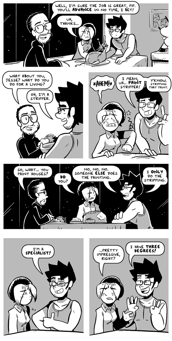
Sam and Fuzzy, on the other hand, functionally has black borders AND gutters, meaning there's nothing but black separating the panels. This creates a very striking look that I'm very fond of! It also creates a lot of unique issues to navigate, especially in a black and white comic. For example, any solid black area that touches the edge of the panel -- like a night sky for example -- blends seamlessly into the black gutter. You have to keep this in mind when you are designing your pages. (For example, a page like this one uses a lot of carefully placed white stars to ensure the reader can still tell where the edges of the panels are.)
With our current story, I'm playing around with an inverted look: solid white gutters and borders. This is something I've done with a lot of my dog comics, but not with any of my black-and-white stories. It's interesting, because in black and white, it has all the same restrictions as my old black-guttered comics, only inverted... now it's the white areas of the panels that will blend seamlessly into the gutters.
It's fun to play with! But I think it's something I'd only use selectively. I am mostly liking how it turned out for this story... I think it gives it an airy and, dare I say snowy vibe that feels good for a holiday tale! But I had to make a lot of really specific staging decisions to make it work. (Like the way that some interior scenes alternate between shots in front of white walls, grey walls, and black "night-sky" filled windows to ensure the panel separations are parsable.) In the future, I think I'd just put black borders around at least some of the panels like a normal person, but I wanted to try something else this one time and live dangerously!
That's a wrap for this week, team. See you on Monday with our next comic!
-Sam Logan


